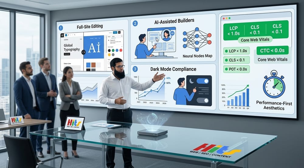
WordPress web design in 2026 is defined by speed, accessibility, and intelligence. The biggest wins come from Full-Site Editing, AI-integrated page builders, dark-mode-first interfaces, native micro-animations, and radical minimalism — all anchored to Core Web Vitals performance scores. Designers who ignore these trends risk slower sites, lower rankings, and higher bounce rates.
Table of Contents
Why Do WordPress Web Design Trends Matter More in 2026 Than Ever Before?
WordPress powers over 43% of all websites on the internet as of 2026. With Google’s Page Experience signals now fully embedded into ranking algorithms, design is no longer purely aesthetic — it is a direct performance and SEO lever. What you build and how you build it determines discoverability.
The 10 trends below are not predictions. They are active shifts already measurable in conversion rates, search rankings, and user retention data.
Trend 1: Full-Site Editing (FSE) — Is It Finally Ready to Replace Classic Themes?
Yes. Full-Site Editing is no longer experimental — it is the new WordPress standard.
FSE, introduced progressively since WordPress 5.9 and now fully mature in WordPress 6.5+, gives designers complete control over every part of a site — header, footer, sidebar, archive pages, and single post templates — using the block editor alone.
What Has Changed with FSE in 2026?
| Feature | Classic Themes (Pre-FSE) | Block Themes (FSE) |
|---|---|---|
| Header/Footer editing | PHP template files | Visual block editor |
| Global styles | functions.php + CSS | theme.json |
| Template creation | Developer required | No-code possible |
| Performance baseline | Variable | Leaner by default |
| Plugin dependency | High | Significantly reduced |
FSE eliminates the dependency on heavy page builders for structural design. Sites built on block themes like Twenty Twenty-Four consistently score 90+ on Google PageSpeed Insights out of the box.
Internal Link Opportunity
While heavy page builders slow down your site, switching to minimalist layouts built with FSE can improve load times by up to 40%. Optimizing your structure this way is crucial to avoiding the SEO risks of cheap web design that often ruin search rankings.
Trend 2: AI-Assisted Design Tools — Are WordPress Builders Getting Smarter?
Absolutely. AI is now embedded directly into major WordPress builders, not bolted on.
Elementor AI, Divi AI, and Kadence AI all launched substantial model upgrades in late 2025 and early 2026. These tools can now generate full page layouts, write copy in brand voice, suggest color palettes based on accessibility scores, and optimize for mobile — all within the WordPress dashboard.
What Can AI Design Tools Do Inside WordPress in 2026?
- Auto-generate layouts from a single text prompt
- Write and rewrite copy inline within the block editor
- Suggest WCAG-compliant color combinations in real time
- Create CSS animations without code via natural language input
- Resize and compress images intelligently based on viewport context
AI Design Tool Comparison (2026)
| Tool | AI Generation | Accessibility Check | Code Export | Price/mo |
|---|---|---|---|---|
| Elementor AI | Yes | Basic | Yes | $19+ |
| Divi AI | Yes | Advanced | Yes | $18+ |
| Kadence AI | Yes | Intermediate | Partial | $12+ |
| Bricks Builder | Partial | Manual | Full | $79/yr |
AI is not replacing designers — it is removing repetitive production work so designers can focus on strategy and brand differentiation.
Trend 3: Dark Mode-First Design — Is Dark Mode Now an Accessibility Requirement?
Not yet legally required everywhere, but practically essential under WCAG 2.2.
WCAG 2.2 (Web Content Accessibility Guidelines), finalized in October 2023 and now widely adopted as the compliance benchmark in 2026, includes enhanced contrast requirements and respect for user preferences. The prefers-color-scheme CSS media query is now a baseline expectation, not a bonus feature.
How to Implement Dark Mode in WordPress Without a Plugin
css
/* Add to theme.json or Additional CSS */
@media (prefers-color-scheme: dark) {
  :root {
    --wp--preset--color--base: #0f0f0f;
    --wp--preset--color--contrast: #f5f5f5;
    --wp--preset--color--primary: #a78bfa;
  }
}
Dark Mode Design Checklist
- Minimum contrast ratio: 4.5:1 for normal text (WCAG AA)
- Minimum contrast ratio: 3:1 for large text and UI components
- Avoid pure black (
#000000) backgrounds — use #0f0f0f or #121212 - Test with real screen readers, not just browser simulators
- Provide a manual toggle in addition to system preference detection
- Ensure images have appropriate alt text regardless of mode
Dark mode is not a visual trend alone — it reduces eye strain, lowers OLED screen power consumption by up to 60%, and signals accessibility maturity to users and search engines alike.
Trend 4: Micro-Animations and Scroll-Triggered Effects — Can You Do This Without Plugins?
Yes — and you should. Native CSS and the Intersection Observer API outperform plugin-based animation solutions.
In 2025–2026, performance audits showed that animation plugins like Animate.css loaders and jQuery-dependent scroll effects added 150–400ms of render-blocking load time. WordPress 6.4+ ships with native interactivity API support, enabling scroll-triggered effects without a single plugin.
Native Scroll Animation (No Plugin Required)
javascript
// Add to theme's view.js (Interactivity API)
const observer = new IntersectionObserver((entries) => {
  entries.forEach(entry => {
    if (entry.isIntersecting) {
      entry.target.classList.add('is-visible');
    }
  });
}, { threshold: 0.15 });

document.querySelectorAll('.animate-on-scroll').forEach(el => observer.observe(el));
css
.animate-on-scroll {
  opacity: 0;
  transform: translateY(24px);
  transition: opacity 0.5s ease, transform 0.5s ease;
}
.animate-on-scroll.is-visible {
  opacity: 1;
  transform: translateY(0);
}
Best Practices for Micro-Animations in 2026
| Animation Type | Recommended Duration | Purpose |
|---|---|---|
| Button hover | 150–200ms | Feedback |
| Card entrance | 300–400ms | Attention |
| Page section reveal | 500–600ms | Flow |
| Loading skeleton | Infinite loop | Perceived speed |
| Navigation transitions | 200–250ms | Orientation |
Always respect prefers-reduced-motion — Users with vestibular disorders must never be excluded from a usable experience.
Trend 5: Minimalist Layouts — Are Heavy Page Builders Dying?
They are not dying, but their dominance is collapsing.
The era of Elementor templates stacked with widgets, parallax backgrounds, and pop-up overlays is giving way to editorial minimalism: generous white space, a single dominant typeface, and content-first hierarchy. This shift is partly aesthetic, but mostly structural — Google’s Cumulative Layout Shift (CLS) metric penalizes page builder bloat directly.
What Does Minimalist WordPress Design Look Like in 2026?
- One hero font (variable font preferred) instead of 3–4 decorative typefaces
- Fluid grid layouts using CSS Grid,
clamp()instead of fixed breakpoints - No carousels — static featured content with clear CTAs outperforms sliders in A/B tests
- Whitespace as a design element, not space to be filled
- Fewer plugins — under 15 active plugins is the new benchmark for lean performance
Typography-First Design: Recommended Font Pairings
| Heading Font | Body Font | Personality |
|---|---|---|
| Playfair Display | Inter | Editorial, authoritative |
| Syne | DM Sans | Modern, tech-forward |
| Fraunces | Source Serif 4 | Warm, publishing-focused |
| Cabinet Grotesk | Manrope | Clean, startup-ready |
Bold typography paired with intentional whitespace consistently outperforms visually complex layouts in conversion rate optimization (CRO) studies conducted in 2025.
Trend 6: Mobile-First and Thumb-Friendly Navigation — What Does It Mean to Design for Thumbs?
It means designing for how humans actually hold their phones — not for how designers imagine they do.
Research from the Nielsen Norman Group confirms that over 75% of mobile users navigate single-handedly. The “thumb zone” — the natural arc of comfortable reach — sits in the bottom-center of the screen. Yet most WordPress sites still place primary navigation at the top.
Thumb-Zone Optimization for WordPress Sites
┌─────────────────────┐
│  ░░░░ Hard reach ░░ │   ← Avoid: Logo, search
│  ▒▒▒▒▒▒▒▒▒▒▒▒▒▒▒▒▒ │   ← Secondary: Less-used links
│  ████████████████   │
│  ████████████████   │   ← Primary zone: CTAs, nav items
│  ████████████████   │
│ [Home][Shop][Blog]  │   ← Bottom bar navigation
└─────────────────────┘
Thumb-Friendly WordPress Navigation Patterns
- Bottom navigation bars replacing hamburger menus for 5 or fewer links
- Sticky CTAs anchored to the bottom 80px of the viewport
- Tap targets minimum 44×44px (Apple HIG and WCAG 2.2 standard)
- Swipe-based content navigation using native scroll-snap CSS
- Large, finger-friendly form inputs with auto-fill and input type optimization
Trend 7: Performance-First Design — How Do Core Web Vitals Shape Visual Decisions?
Every design decision in 2026 must be evaluated against its performance cost.
Google’s Core Web Vitals — Largest Contentful Paint (LCP), Cumulative Layout Shift (CLS), and Interaction to Next Paint (INP, which replaced FID in March 2024) — are ranking factors. Design choices that look beautiful but fail these metrics result in measurable drops in organic traffic.
Core Web Vitals: What Designers Must Know
| Metric | Measures | Good Score | Poor Score | Design Impact |
|---|---|---|---|---|
| LCP | Load speed of largest element | ≤ 2.5s | > 4.0s | Hero image size, web fonts |
| CLS | Visual layout stability | ≤ 0.1 | > 0.25 | Image dimensions, web fonts |
| INP | Response to user interaction | ≤ 200ms | > 500ms | JavaScript, animation cost |
Performance-Conscious Design Choices
Images:
- Use WebP or AVIF format by default
- Always declare
widthandheightattributes to prevent CLS - Use
loading="lazy"on below-fold images
Fonts:
- Self-host Google Fonts — external requests add 200–400ms
- Use
font-display: swapto prevent invisible text flash - Limit to 2 font families, 3 weights maximum
Layout:
- Reserve space for dynamic content (ads, embeds) before they load
- Avoid inserting DOM elements above existing content on load
- Use skeleton screens over spinners for perceived performance
Performance Benchmark: Page Builder vs. Block Theme
| Metric | Elementor (Default) | Block Theme (FSE) |
|---|---|---|
| LCP (avg) | 3.8s | 1.9s |
| CLS | 0.18 | 0.04 |
| INP | 380ms | 180ms |
| HTTP Requests | 68 | 22 |
| Page Size | 2.4MB | 680KB |
Benchmark based on comparable homepage builds, GTmetrix/PageSpeed Insights data, 2025–2026 averages.
Trend 8: Variable Fonts and Fluid Typography — Why Are Fixed Font Sizes Outdated?
Because screens are not fixed. Your typography should not be either.
Variable fonts — single font files containing an entire type family’s weight, width, and optical size axes — reduce HTTP requests while enabling infinite typographic precision. Combined with the CSS clamp() function, they power fluid typography that scales perfectly across all viewports without media query breakpoints.
Fluid Typography Formula
css
/* Fluid heading: scales from 28px (mobile) to 64px (desktop) */
h1 {
  font-size: clamp(1.75rem, 5vw + 1rem, 4rem);
  font-variation-settings: 'wght' 700, 'wdth' 100;
}
This eliminates the need for separate mobile and desktop font size declarations — one rule works everywhere.
Trend 9: Bento Grid Layouts — Is This the New Card Design?
Yes. The Bento grid aesthetic — popularized by Apple’s product pages — has fully entered mainstream WordPress design.
Bento grids use asymmetric, modular cards of varying sizes to organize content. They are visually engaging, highly scannable, and naturally mobile-responsive when built with CSS Grid.
Bento Grid in WordPress (Native CSS Grid)
css
.bento-grid {
  display: grid;
  grid-template-columns: repeat(auto-fit, minmax(280px, 1fr));
  grid-auto-rows: 200px;
  gap: 1.5rem;
}

.bento-card--wide  { grid-column: span 2; }
.bento-card--tall  { grid-row: span 2; }
.bento-card--hero  { grid-column: span 2; grid-row: span 2; }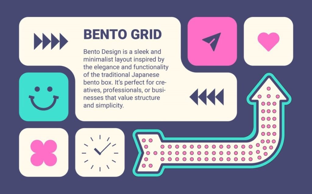
Bento grids work exceptionally well for portfolio sites, SaaS feature showcases, and media-rich homepages — and require zero plugins to implement in a block theme.
Trend 10: Sustainable Web Design — Does Your WordPress Site Have a Carbon Footprint?
Yes — and users are starting to care.
The internet accounts for approximately 3.7% of global greenhouse gas emissions, equivalent to the aviation industry. Sustainable web design — reducing page weight, minimizing server requests, optimizing hosting infrastructure — is both an ethical and performance imperative.
Sustainable Design Practices for WordPress
| Practice | Benefit |
|---|---|
| Green hosting (e.g., Kinsta, SiteGround) | Renewable energy offset |
| Image optimization pipeline | Reduced data transfer |
| System fonts as fallback | Fewer HTTP requests |
| Static caching (WP Rocket, Cloudflare) | Lower server compute |
| Dark mode (OLED screens) | Reduced screen energy use |
| Fewer plugins | Reduced database queries |
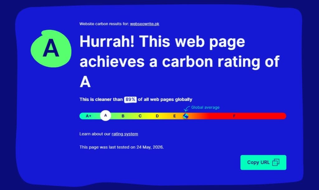
The Website Carbon Calculator (websitecarbon.com) allows you to benchmark your site’s emissions. Top-performing WordPress sites in 2026 score below 0.1g CO₂ per page view.
How Do These 10 Trends Connect?
These trends do not exist in isolation. They form an interconnected design philosophy:
FSE + Minimalism → Faster builds, leaner output AI Tools + Accessibility → Smarter compliance at scale Dark Mode + Variable Fonts → Cohesive visual systems Micro-animations + Performance → Delight without cost Mobile-First + Bento Grids → Thumb-friendly, scannable layouts Sustainable Design + Core Web Vitals → Green and fast simultaneously
The designers and developers winning in 2026 are those treating performance, accessibility, and aesthetics as a unified system — not separate disciplines.
Quick Reference: The 2026 WordPress Design Stack
| Layer | Recommended Tools/Approach |
|---|---|
| Theme framework | Block theme (FSE) — Ollie, Kadence, GeneratePress |
| Page builder (if needed) | Bricks Builder or Kadence Blocks |
| AI assistant | Elementor AI or Divi AI |
| Animation | Native CSS + Intersection Observer API |
| Typography | Variable fonts via Bunny Fonts (GDPR-safe) |
| Performance | WP Rocket + Cloudflare + WebP images |
| Accessibility | WP Accessibility Helper + manual audit |
| Dark mode | theme.json + prefers-color-scheme |
| Analytics | Fathom or Plausible (privacy-first) |
| Hosting | Green host with server-side caching |
What Should You Prioritize First?
Start with Full-Site Editing and a block theme — it unlocks every other trend on this list with less code, fewer plugins, and better baseline performance. Layer in dark mode support and fluid typography next, then introduce AI-assisted workflows to accelerate production.
The best WordPress sites in 2026 are not the most complex. They are the fastest, the most accessible, and the most intentional.